With a vision to epitomise elite and luxurious marine services, Euromarine targets luxury yacht owners and builders, aiming to infuse sophistication and exclusivity into its visual identity.
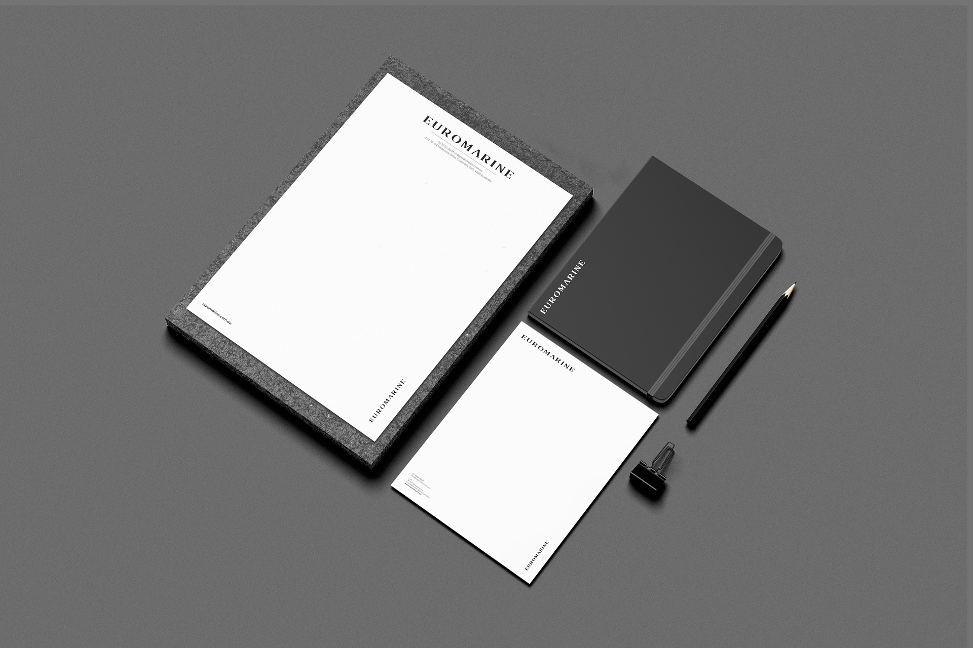
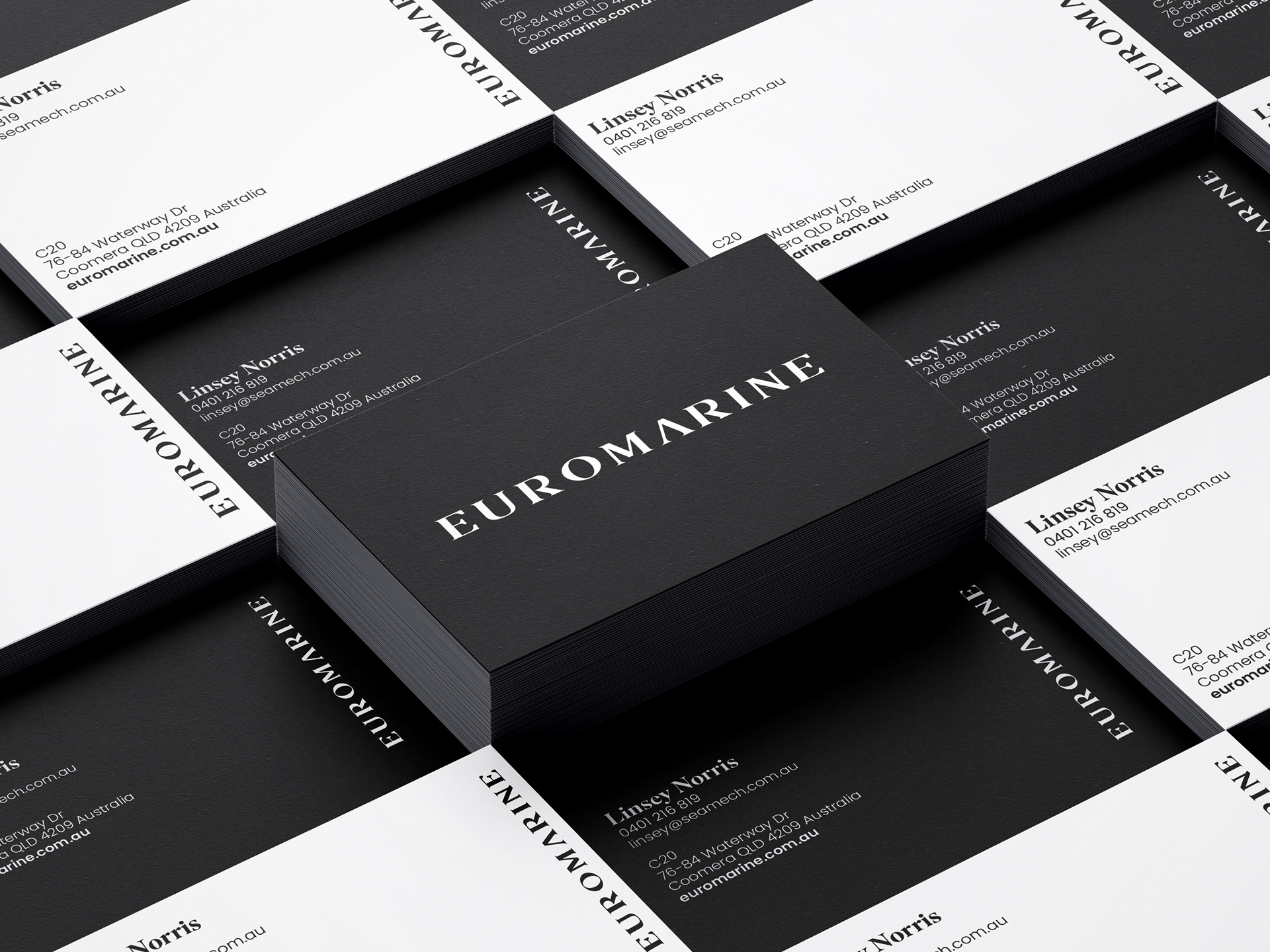
This comprehensive brand overhaul included a logo refresh, meticulous development of brand assets, and the creation of visually captivating elements for both print and digital platforms. Inspired by the opulence of European elegance and luxury automotive design, our approach focused on simplicity, refinement, and an understated palette of black, white, and silver, evoking a timeless sense of exclusivity.
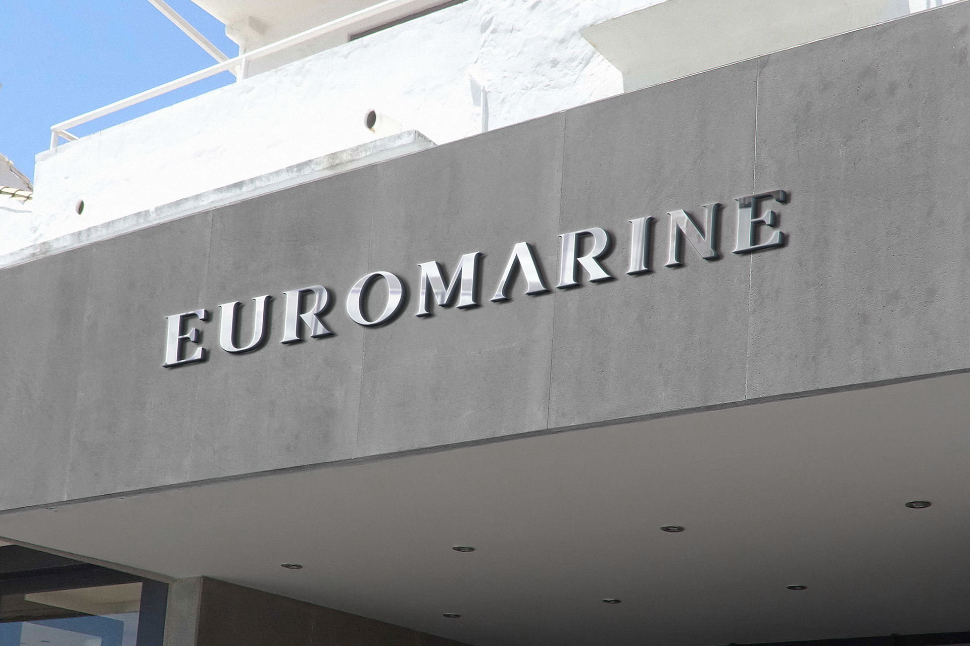
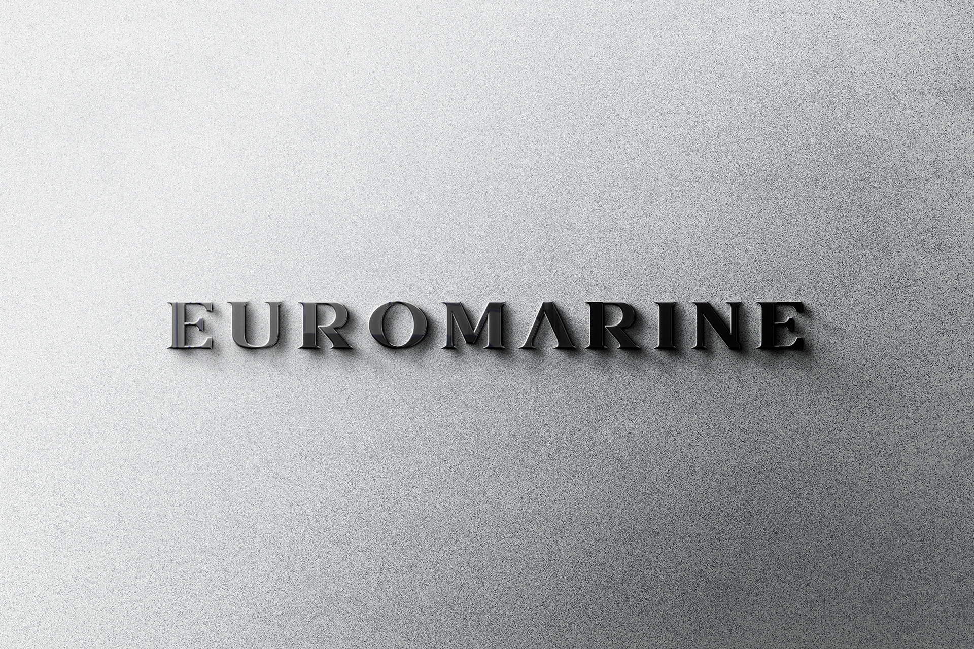
The newly crafted logo blends sleek typography to encapsulate the brand's elite status and unwavering commitment to excellence. From business cards to letterheads and email signatures, each brand asset was designed to convey Euromarine's prestige and professionalism.
The new visual identity firmly positions Euromarine as the pinnacle of marine engineering and mechanics, synonymous with luxury, quality, and exclusivity. Leveraging the esteemed Volvo Penta brand, Euromarine is now poised to redefine standards in the Gold Coast market, offering an unparalleled experience that sets a new benchmark for excellence in the marine industry.
Art Direction • Logo Design • Print & Digital
Euromarine logo mock up on the side of the building

YOU MAY ALSO LIKE...

The Little Red Company - Lady Beatle
Foot Locker Orchard Gateway
Orchard Gateway in Singapore is Foot Locker's biggest store in the world and the pinnacle expression of the brand. Working hand-in-hand with Foot Locker's Singapore design team, I was one of three designers tasked with creating in-store graphics for the five-story mega store.
Tough Mudder - Australia's Filthiest Calendar
I was commissioned by Aruga and Tough Mudder to design “Australia’s Filthiest Calendar”; a limited edition, full-colour calendar celebrating 15 real-life participants of the world-famous mud run.
Lord Mayor's Christmas Carols
As the brand custodian and graphic designer for the Lord Mayor's Christmas Carols, I had the challenge of elevating the event's visual impact across all consumer touchpoints including digital, wayfinding signage, big screen graphics and a 40-page souvenir programme.
Brisbane Lions - 2018 Club Champion
I was entrusted with the task of creating a new visual identity for the Brisbane Lions’ Club Champions evening, which recognises the players’ best performances of the season.
The Little Red Company - Your Song
The Little Red Company's Your Song celebrates the unforgettable music of megastar Elton John and the memorable moments it evokes for everyday people.
Foot Locker QV
Foot Locker's first Australian Power Store was modelled on the successful large-scale retail concept rolled out by the global athletic company across Europe, the US and Asia.
Orange Sky | Social Impact Laundromat
Orange Sky, a social enterprise providing laundry services and listening ears for friends experiencing homelessness, opened its first ever social impact laundromat in Adelaide.
Dead Puppet Society - Strategic Plan
Wynnum Fringe
As a foundation partner of the Wynnum Fringe festival, I was responsible for developing a cohesive and striking brand identity that captured the lively and energetic atmosphere of the event.
Back to Top